Product analytics dashboards need charts that help teams understand user behavior, feature adoption, retention, conversion, revenue, and growth metrics. These dashboards often sit inside SaaS products, internal tools, admin panels, and reporting systems. A chart library affects more than visual design: it shapes loading speed, interaction quality, code maintenance, and how quickly teams can build new analytics views.
Some libraries suit simple metric screens, while others are better for data-heavy dashboards with large datasets and deeper interaction. The six libraries below were selected based on those real product needs.
1. SciChart
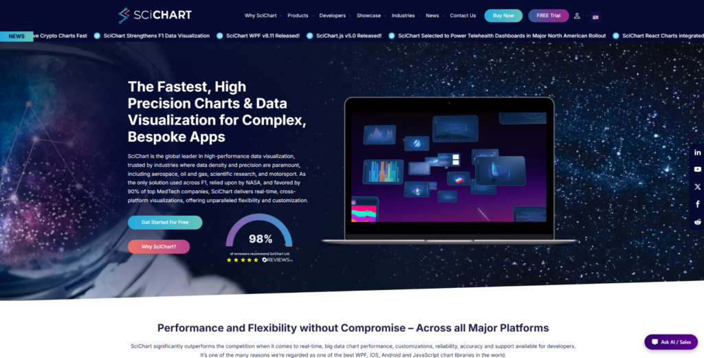
SciChart suits product analytics dashboards where teams need to handle large datasets, frequent updates, zooming, panning, annotations, and detailed user interaction. It is a high-performance JavaScript chart library for SaaS analytics, usage tracking dashboards, financial product metrics, monitoring views, and data-heavy admin interfaces. It is not the easiest option for a small product dashboard with a few basic charts. SciChart is most relevant when chart speed and interaction quality affect the way users analyze product data. That makes it a better match for analytics products where charts are part of the actual workflow, not just a visual layer.
The value of SciChart is not only speed. It also gives teams chart depth, control, examples, documentation, and production support. It handles large browser datasets, supports advanced visuals for complex dashboards, and gives developers control over chart behavior. Its strongest points are practical:
- Handles large datasets and frequent updates in browser-based analytics products;
- Supports advanced chart types for complex product and operational dashboards;
- Gives developers control over annotations, styling, interactions, and chart behavior;
- Provides examples, demos, documentation, and implementation support;
- Suits commercial products where chart speed affects the user experience.
SciChart may be excessive for simple dashboards or early MVP analytics pages. It becomes easier to justify when analytics is central to the product, and chart limitations would slow users down. For standard dashboard charting, TOAST UI Chart offers a different tradeoff.
Where SciChart Fits
SciChart suits SaaS companies, product teams, and engineering teams building data-heavy analytics screens. It is less natural for small internal dashboards with only a few static charts.
2. TOAST UI Chart
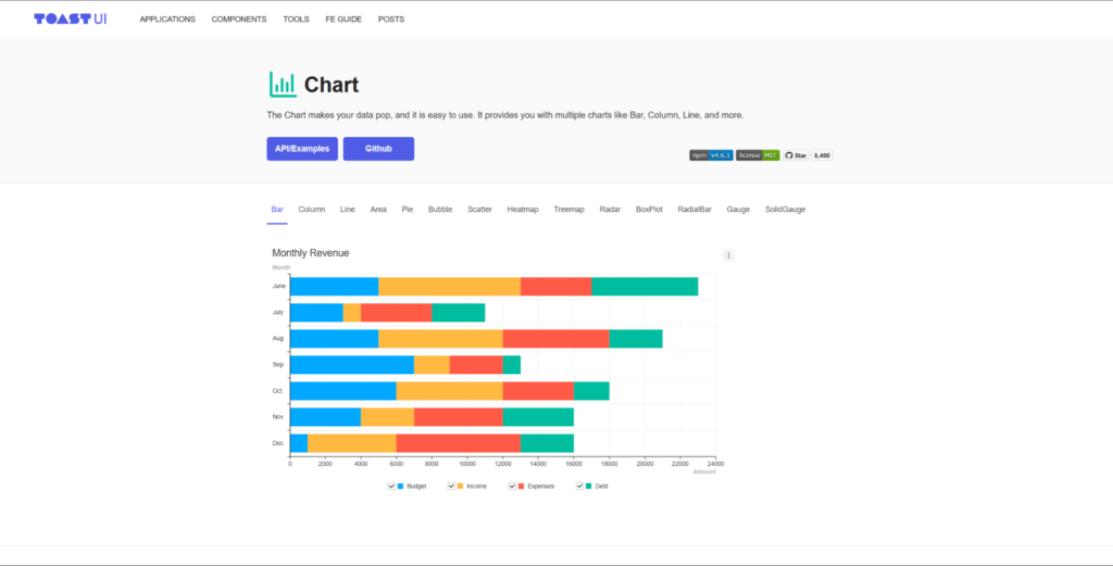
TOAST UI Chart is a practical option for product analytics dashboards that rely on standard charts and clear presentation. Use cases include SaaS dashboards, admin panels, internal reporting tools, feature tracking pages, and business metric views. The library is more relevant for teams that need straightforward implementation than for teams building heavy scientific or financial visualization. It is not a direct rival to SciChart in performance-heavy scenarios. Its appeal comes from clean chart output and a practical setup path.
TOAST UI Chart helps with ordinary product analytics screens. Not every product dashboard needs advanced rendering or unusual chart types. The library covers common charting needs without turning implementation into a large engineering task. It is useful when teams need clean charts for familiar dashboard patterns:
- Covers common chart types used in dashboards and business reporting;
- Helps teams build clear analytics views without a heavy setup process;
- Suits admin panels, SaaS dashboards, and internal product reports;
- Provides a practical path for teams that need standard visualizations;
- Makes sense when charting supports the product, but it is not the main technical risk.
TOAST UI Chart is a good option when charts need to be clean, familiar, and quick to implement. For heavy interaction, large datasets, or advanced chart behavior, teams should test it carefully or compare it with more specialized tools.
Practical Use
TOAST UI Chart suits teams building standard product dashboards, admin panels, and internal analytics pages. It is less convincing for products where charts are the main technical feature.
3. Frappe Charts
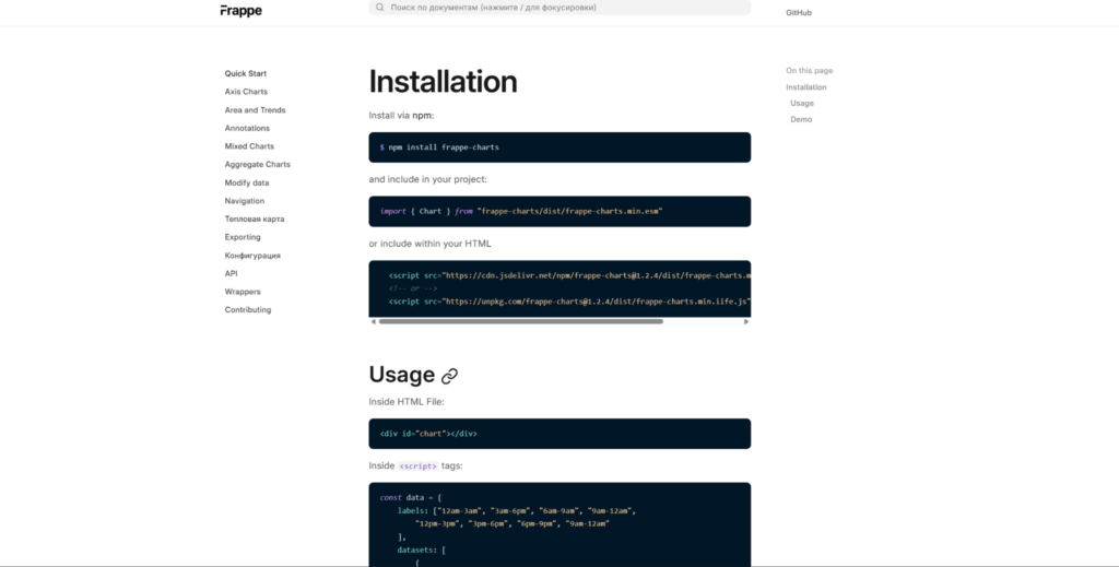
Frappe Charts is a lightweight option for teams that need simple, readable charts without much setup. It suits product metric pages, startup dashboards, internal reports, admin panels, and simple SaaS analytics screens. Its role is not to handle very large datasets or deep custom visualization. The library is useful for simpler charting needs, not for every analytics product. Frappe Charts works best when the dashboard needs clarity more than technical depth.
Frappe Charts helps when speed of implementation and simple visuals matter. Smaller teams can ship clean charts without overbuilding the visualization layer. The library keeps output easy to understand, which is often enough for basic metric screens. Its value is strongest in lightweight analytics pages:
- Provides simple chart types for dashboards and reporting pages;
- Keeps visual output clean and easy to understand;
- Reduces setup work for small product teams and internal tools;
- Fits lightweight analytics pages with modest data needs;
- Works when simple charts are enough to explain key product metrics.
Frappe Charts is not the right option for heavy datasets, advanced interaction, or complex product analytics workflows. It is better for teams that need clear visuals without a large charting stack.
Most Relevant Use
Frappe Charts suits startups, small SaaS teams, internal reports, and simple product metric pages. Larger analytics products may need a deeper charting library as requirements grow.
4. Chartist.js
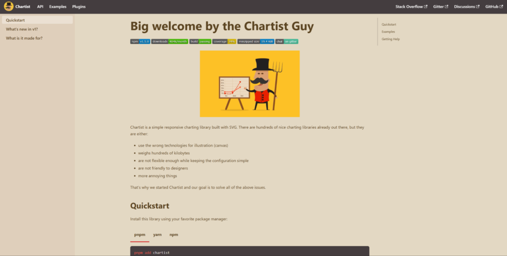
Chartist.js is a simple charting option for teams that need responsive SVG charts with minimal complexity. It suits basic product dashboards, landing page analytics, internal reports, admin views, and lightweight metric panels. The library is not built for advanced product analytics, large data volumes, or highly interactive dashboards. Its value is simplicity and responsiveness, not deep visualization engineering. Chartist.js can work when the charting layer is intentionally small.
Chartist.js is useful for basic chart needs where the team does not want a heavy dependency. Product analytics teams should be careful if they expect dashboards to grow in complexity. The library uses SVG-based charts for simple responsive visualizations. Its role is clearest in lightweight projects:
- Uses SVG-based charts for simple responsive visualizations;
- Covers basic chart needs for reports, admin pages, and metric panels;
- Keeps the charting layer small for lighter web projects;
- Fits teams that value simplicity over advanced interaction;
- Works better for basic visuals than for complex analytics dashboards.
Chartist.js can be a tidy option for small dashboards, but teams should not stretch it into complex analytics work. If product dashboards need filtering, zooming, large datasets, or many chart types, another library will likely be safer.
Suitable Scenarios
Chartist.js suits lightweight dashboards, simple reports, and small web apps. It is less appropriate for SaaS products where analytics is a core feature.
5. React Charts
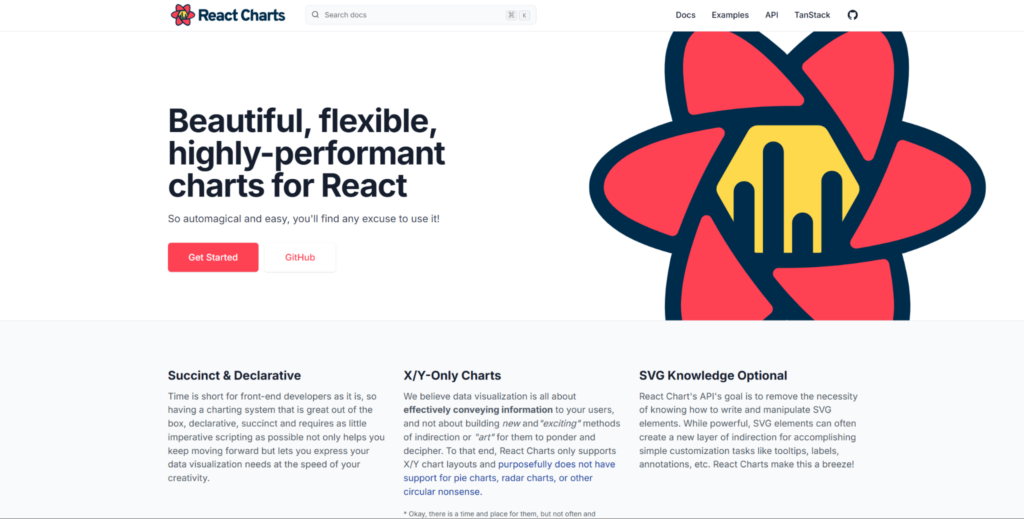
React Charts is a relevant option for teams already building product dashboards in React. It suits product analytics screens, SaaS reporting pages, internal tools, customer dashboards, and feature usage views. The library helps teams keep charting closer to their component-based frontend workflow. It is not a complete analytics platform or a heavy rendering engine. React Charts is more relevant when the team wants lightweight charting inside a React product.
React Charts helps teams stay within a React-friendly development model. It is more about fitting the frontend workflow than covering every advanced visualization case. The library supports common visualization needs for product reporting screens. Its main value is alignment with React-based product development:
- Fits React-based dashboards and product analytics interfaces;
- Helps teams keep chart code closer to component-driven frontend patterns;
- Supports common visualization needs for product reporting screens;
- Works for SaaS dashboards where charts are part of the broader UI;
- Makes sense when React workflow matters more than advanced chart depth.
React Charts can be useful for product dashboards with moderate charting requirements. It is less suitable when the product needs unusual chart types, very large datasets, or advanced rendering behavior.
When It Makes Sense
React Charts suits React teams building product analytics pages, internal reporting views, and customer dashboards. Deeper analytics products may need a library with broader chart coverage or stronger rendering support.
6. RoughViz
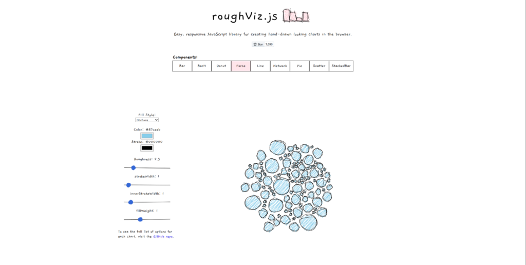
RoughViz is a creative visualization library, not a serious production dashboard engine. It suits prototypes, storytelling pages, internal presentations, informal analytics, and lightweight visual experiments. Its hand-drawn style can help charts feel less formal, but that same style limits its use in serious product analytics dashboards. It should not be compared directly with SciChart or other production-heavy tools. RoughViz belongs in this list as a niche option for visual communication, not as a default dashboard library.
RoughViz is useful when the goal is to make data approachable rather than build a strict analytics interface. It can support early exploration, internal presentation work, and creative reporting. The library creates sketch-style charts for informal data storytelling. It is most relevant when visual tone matters more than dashboard precision:
- Creates sketch-style charts for informal data storytelling;
- Fits prototypes, presentations, lightweight reports, and exploratory visuals;
- Helps teams make simple analytics feel less formal;
- Works when visual tone matters more than precise dashboard polish;
- Requires caution for serious product analytics or customer-facing dashboards.
RoughViz should not be used as the main charting layer for a mature analytics product. It can be useful for early ideas, internal storytelling, or creative data communication.
Where RoughViz Helps
RoughViz suits prototypes, data storytelling, internal presentations, and informal reports. Production analytics dashboards should usually rely on a more standard charting library.
Final Thoughts
Product analytics dashboards need chart libraries that match the depth of the product, not only the look of the chart. SciChart is the strongest option when dashboards involve large datasets, demanding interaction, and performance-sensitive analytics. TOAST UI Chart, Frappe Charts, Chartist.js, React Charts, and RoughViz cover lighter or more specific needs, from standard dashboards to prototypes and storytelling.
No library should be chosen only because it looks good in demos. Test chart behavior with real product data, expected interactions, and long-term maintenance needs before choosing.